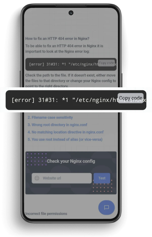
Scrollable elements on Mobile websites
Last updated:
Why are inline scrollbars hard to use on mobile?
In page scrollbars are best to be avoided on mobile phones. A scrollable element is not a user friendly way to present information because it is hard to read the content easily.
Avoid inline scrollable areas on a mobile website (and ultimately on desktop as well) because:
1) No visible scrollbar
Some browsers on mobile phones show no scrollbars. Only when you interact with an element you see a scrollbar.
Try to remove the scrolling elements if possible. An alternative is to give the user visual information that the element is scrollable.
2) Hijacking page scroll
A scrollable element that is too large makes it hard to scroll the parent scrollable element. The problem often is that the page scroll is hijacked by the inner scroll area.
Do the Mobile Friendliness test
Checkout the ExcellentWebCheck services
ExcellentWebCheck's goal is to improve the online user experience. The tools of ExcellentWebCheck help to detect and improve usability problems on your website.