Content of page wider than screen of mobile device
Last updated:
How to solve content wider than screen?
Content that is wider than the viewport causes a horizontal scrollbar. This makes it possible to scroll in 2 directions. Scrolling in 2 different directions makes it hard to read and interact with the web page.
To solve this issue:
- Detect the element(s) that are wider than the screen
- Fix the overflow problem that causes the horizontal scrollbar
Detect the element(s) that are wider than the screen
First, find the element(s) that cause the horizontal scrollbar. You can find these by opening the devtools in your browser.
- Open the page with for example Google Chrome and open Chrome Devtools.
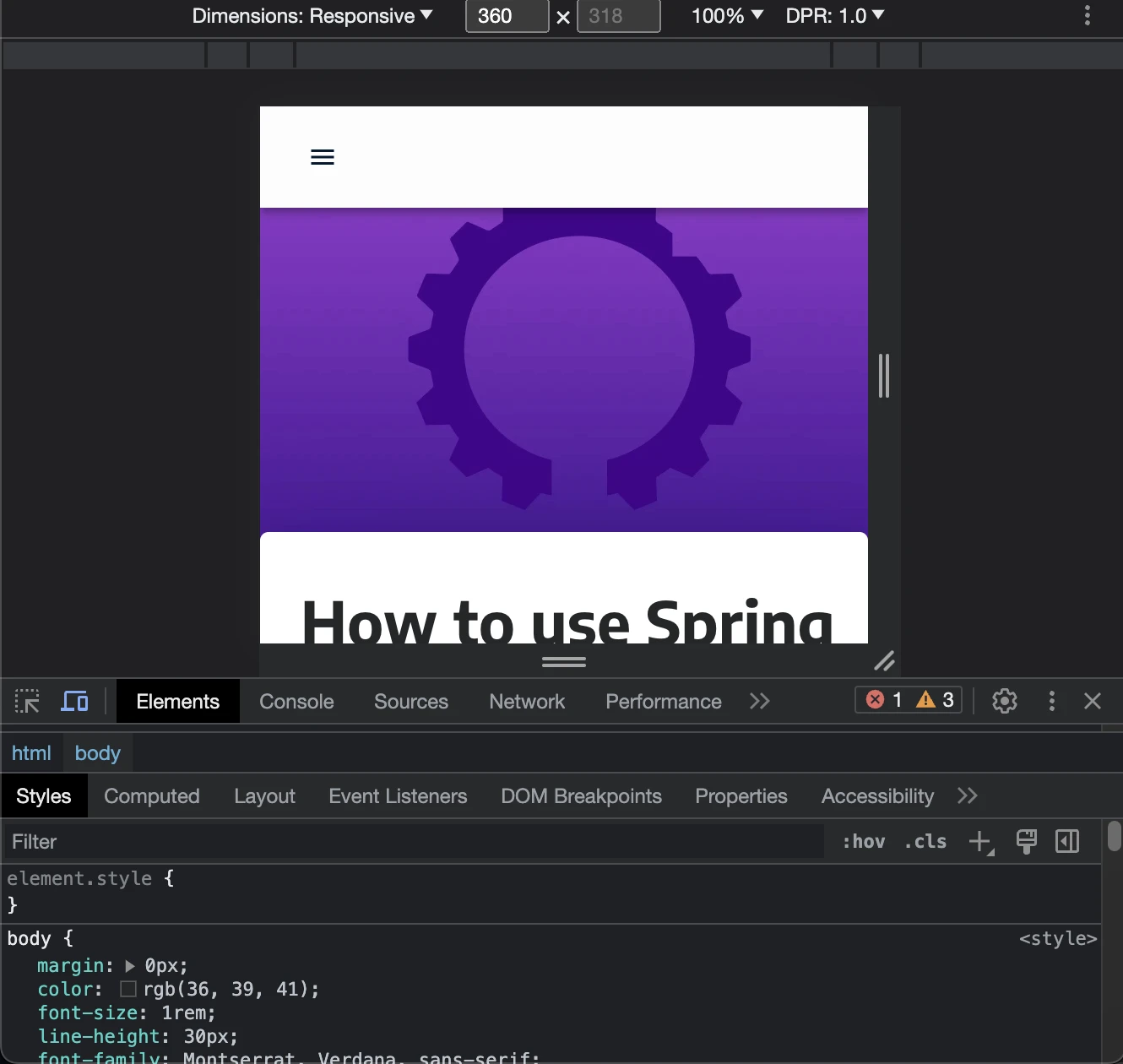
- Scroll to the right and visually inspect which element causes the issue.
By using the element inspector, you can find the element that causes the page to overflow.
Fix the overflow problem that causes the horizontal scrollbar
There are many things that can cause the element to overflow.
Responsive images
An image is one of the most common reasons why a page has a horizontal scrollbar on a mobile phone. To make an image responsive, make sure it has a width: 100% set.
<img
  src="responsive.webp"
  alt="Example of responsive image"
  style="width: 100%"
/>
Non responsive width styles
Width styles are another cause for overflowing elements. By not using pixels as the main unit, you can prevent the element causing an overflow.
Alternatives for pixel units are:
- Viewport size (
vwfor viewport-width) - Percentages (
%) - Relative to font-size of root element (
rem) - Relative to the font-size of the element (
em)
Long piece of text (word-break)
A long word can cause the text to overflow the parent element and cause the content to be wider than the screen.
A solution for this is to set the word-break css property to break-word or break-all.
Media Query BreakPoints
Make sure your design is responsive so that your website works well on mobile phones. Use media query breakpoints to change how elements appear at a certain breakpoint.
For example: change a flexbox direction to column on mobile.
.container {
  display: flex;
  flex-direction: row;
}
@media (max-width: 500px) {
  .container {
    flex-direction: column;
  }
}
<div class="container">
  <div class="item">
    <p>Services</p>
    <img src="services.png" />
  </div>
  <div class="item">
    <p>Contact</p>
    <img src="contact.png" />
  </div>
</div>
What is the algorithm?
The mobile friendliness test uses a chrome browser to load every page of a website. The width of the screen is 360px during evaluation of the mobile friendly test.
360px x 800px is one of the most used screen resolutions which is why ExcellentWebCheck uses that to test mobile friendliness.
This check fails when the scrollWidth of the body is larger than the clientWidth of the body.

Do the Mobile Friendliness test
Checkout the ExcellentWebCheck services
ExcellentWebCheck's goal is to improve the online user experience. The tools of ExcellentWebCheck help to detect and improve usability problems on your website.