Text element too small for mobile device
Last updated:
Impact: MINOR
This evaluation is included in the Mobile Friendly test offered by ExcellentWebCheck. Ensuring that your website is mobile-friendly and responsive is crucial not only for enhancing the user experience but also for optimizing your site's SEO performance.
What is the issue and how to solve it?
Text elements on a mobile website that are too small indicate that the website is not responsive. Text that can easily fit on one line should not appear as a multiline text.
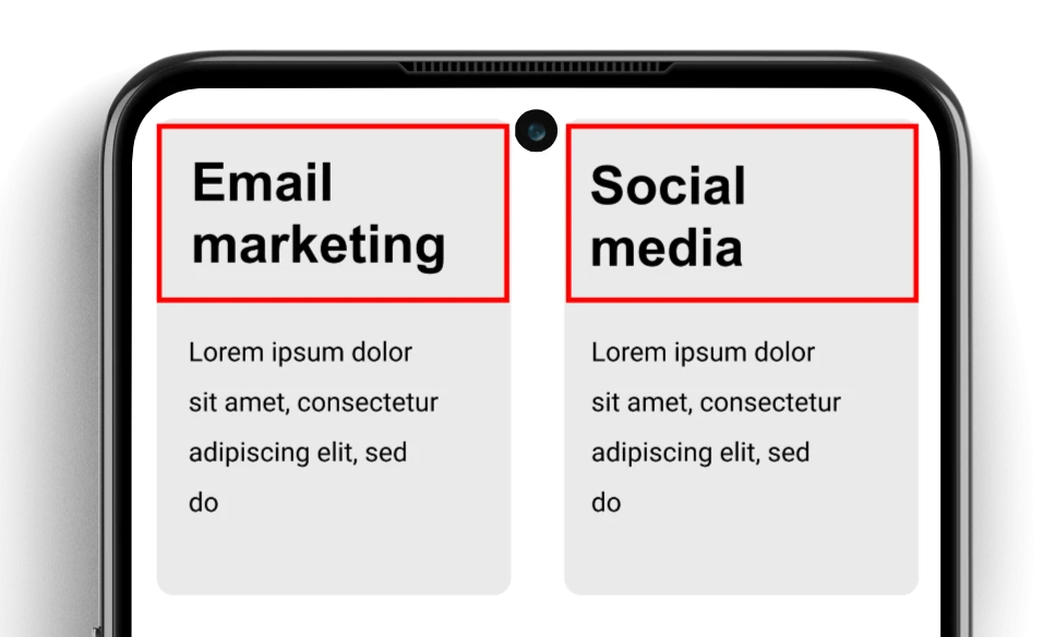
In the image you see that the titles have not enough space to fit on one line due to the row based layout.
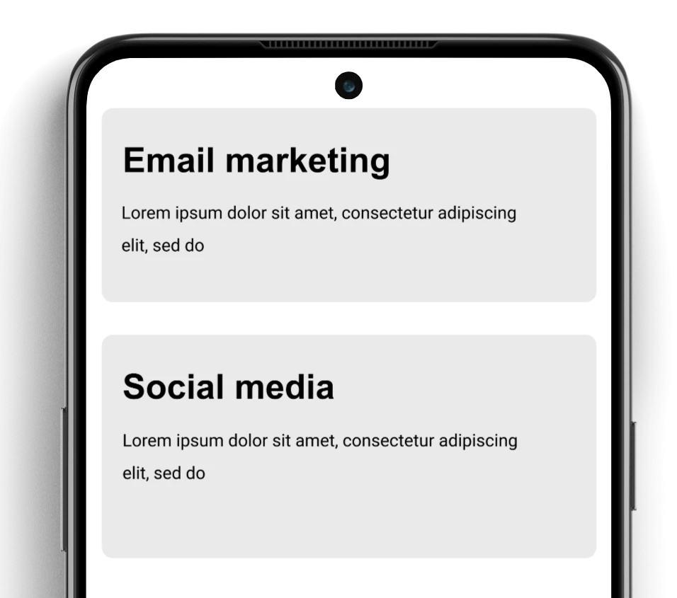
A good solution would be to have the sections align as a column instead of a row:

Do the Mobile Friendliness test
Was this article helpful?
Thanks for your feedback!
Checkout the ExcellentWebCheck services
ExcellentWebCheck's goal is to improve the online user experience. The tools of ExcellentWebCheck help to detect and improve usability problems on your website.