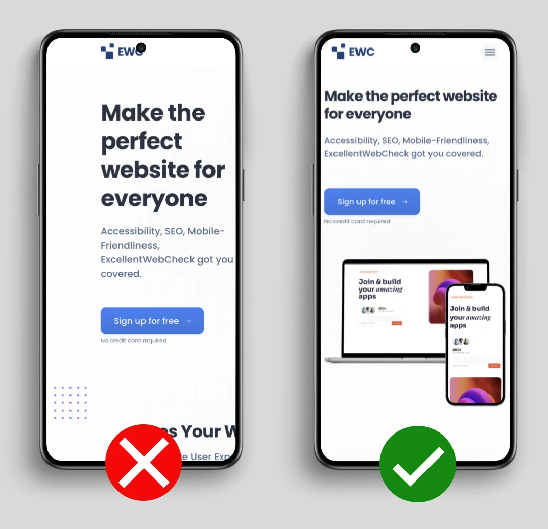
Why is width=device-width important for viewport tag?
Last updated:
Impact: CRITICAL
This evaluation is included in the Mobile Friendly test offered by ExcellentWebCheck. Ensuring that your website is mobile-friendly and responsive is crucial not only for enhancing the user experience but also for optimizing your site's SEO performance.
What does width=device-width do in the viewport meta tag?
A good viewport looks like this:
<meta name="viewport" content="width=device-width, initial-scale=1.0" />
This viewport meta tag tells the browser that the width of the page must be equal to the width of the device. Without width=device-width the browser determines what is likely the best size for the page. A responsive website however should work with small to large screen sizes.

To prevent the browser from choosing the wrong width for the page, set the viewport meta tag with width=device-width.
Do the Mobile Friendliness test
Was this article helpful?
Thanks for your feedback!
Checkout the ExcellentWebCheck services
ExcellentWebCheck's goal is to improve the online user experience. The tools of ExcellentWebCheck help to detect and improve usability problems on your website.