Mobile-Friendly Breadcrumb navigation
Last updated:
Why are breadcrumbs important?
Breadcrumbs play an important role in website navigation by enabling users to traverse the website’s hierarchical structure. Breadcrumbs facilitate user wayfinding on the website. They also provide readers with a clear and informative overview of the website’s hierarchy.
Search engines also utilize breadcrumbs to navigate a website’s hierarchical structure. Notably, search engines such as Google even incorporate breadcrumbs into their search results.
Challenge of responsive breadcrumbs
Mobile-friendly breadcrumbs are challenging for a couple of reasons:
- There is not much horizontal space for breadcrumbs
- Tap targets must be large enough
- Font size must be readable

Do the Mobile-Friendliness test
Most search traffic comes from mobile devices. Is your website optimized?
How to implement breadcrumbs right on mobile?
Breadcrumbs are powerful but should be implemented with care on mobile:
1) Don’t use too much space for breadcrumbs
Use just enough space for navigation, including the breadcrumbs. This means that you shouldn’t make the navigation too small and not too large.
Breadcrumbs that wrap multiple lines use too much space and should be avoided.
2) Large enough tap targets
The links should be large enough. A user might accidentally click on the wrong element if the items in the breadcrumb section leading to frustration.
Use enough padding around the links. Use the mobile tap target check to make sure that the links are appropriately sized.
3) Don’t use scrollable breadcrumb navigation
Inline scrollable areas are not user-friendly on mobile. Scrollable breadcrumbs can be hard to use and it is not always clear to a user that an item can be scrolled.
Examples of mobile breadcrumb navigation
1) GitHub breadcrumbs
GitHub has breadcrumbs on mobile which open in a modal. The modal makes it possible to make the tap target large enough.
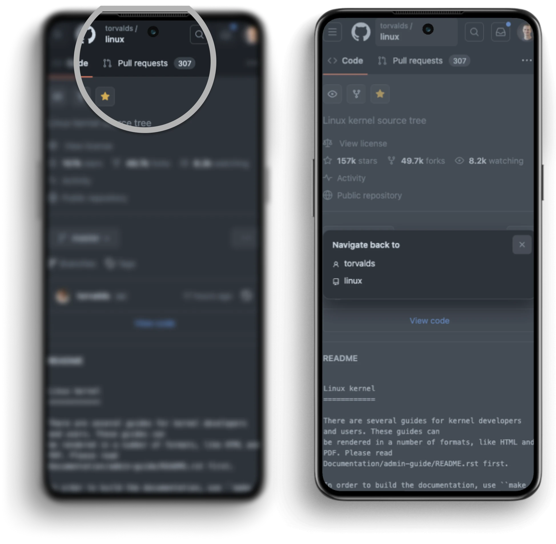
GitHub’s approach uses 104px in height for all navigation items on a mobile website.
GitHub put these navigation options in a header height of just 104px:
- Button to open drawer menu
- GitHub icon which links to the home page
- Button to open the breadcrumbs
- Button to open the search
- Button to open the inbox
- Button to go to your profile
- Different Tabs
GitHub uses this type of breadcrumb only for 2 levels of hierarchy. Other items that could be put in the breadcrumbs are covered in the tabs below the breadcrumbs. The links that could be put in the breadcrumbs are made available in the tabs.
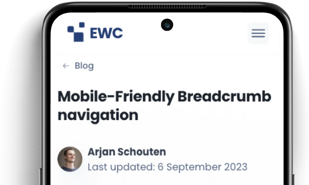
2) ExcellentWebCheck
Another way of presenting breadcrumbs on mobile is by only showing the parent page in the breadcrumbs. Navigating the whole hierarchy down to the home page requires multiple clicks.
3) Google developers
In the example below we see that Google wraps breadcrumbs on their Google Developers website.

This is a way I don’t recommend doing since it can use too much space very quickly. How mobile-friendly is your website?

As the founder of ExcellentWebCheck, I'm very passionate about accessibility and ensuring equal access to information and services online. With the current speed of digitalization, it is crucial to make sure that everyone has access to important goods and services such as healthcare, financial services, education, and government resources, regardless of their abilities. By advocating for inclusive design principles and leveraging cutting-edge technologies, we aim to create digital environments that are not only compliant with accessibility standards but also intuitive and user-friendly for all individuals.